Steemit.ly
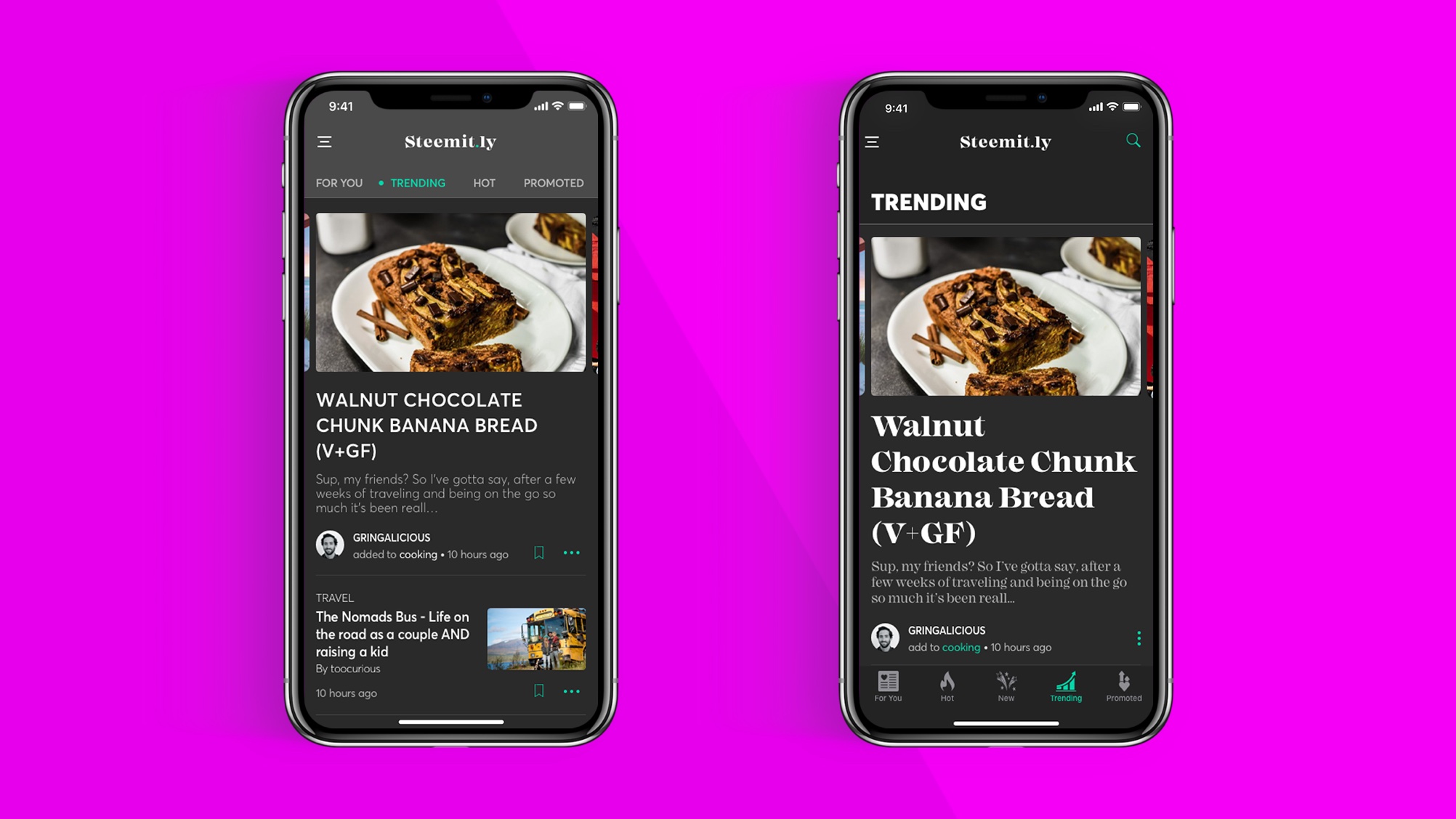
Category screen choices, choices—oh, soo many choices. Ok, so I know that the benefits of having the navigation at the bottom as tabs is a good thing; reachability/accessibly, but if I but the navigation on the top as a sliding navigation I'll gain more vertical space. I really want to gain more space and keep the viewport looking clean and un-cultured. 🤔🤔and more🤔
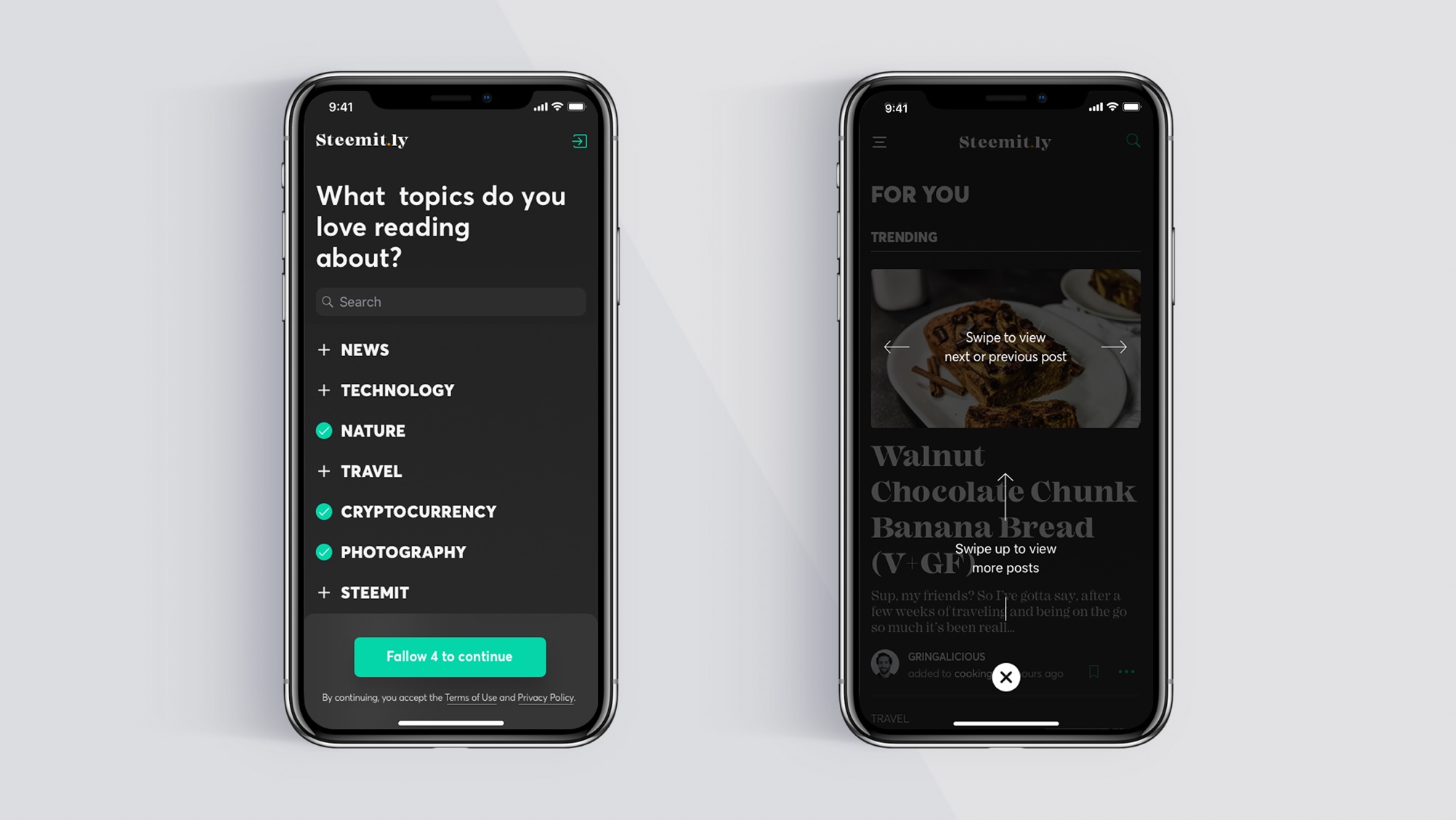
Choose your topics—after flicking threw the onboarding screens (still to be done) the user will be presented with a mandatory screen where they need to choose 4 topics that they'd like to fallow. These choices will then be used to populate the users feed screen. It's widely known that not all users are super tech savvy so let's give them a hint on how they can navigate within the app. On a side note—I plan to change this; the 💡 would be to place the navigational cues as inline information, utilizing color and font style as emphasis. I believe this would be a better ui experience and visually cleaner.
The feed area is broken down into four sections; trending, new, hot and promoted. in order to reduce the vertical scrolling for the user, I utilize multi-directional scrolling. also the amount of information the user is presented is limited. My believe is that by doing so this will alleviate information overload, and can also help to reduce the time spent in the app—as the user is not fed an endless list of posts, instead they receive a short list of their curated topics (sure I want people to spend time in the app, but as the saying goes: use it, don't abuse it. It's clinically better to spend shorter amounts of time in any app). If the user wants to view more and dig dipper into the topic, they can do so by tapping the action link "VIEW ALL...".
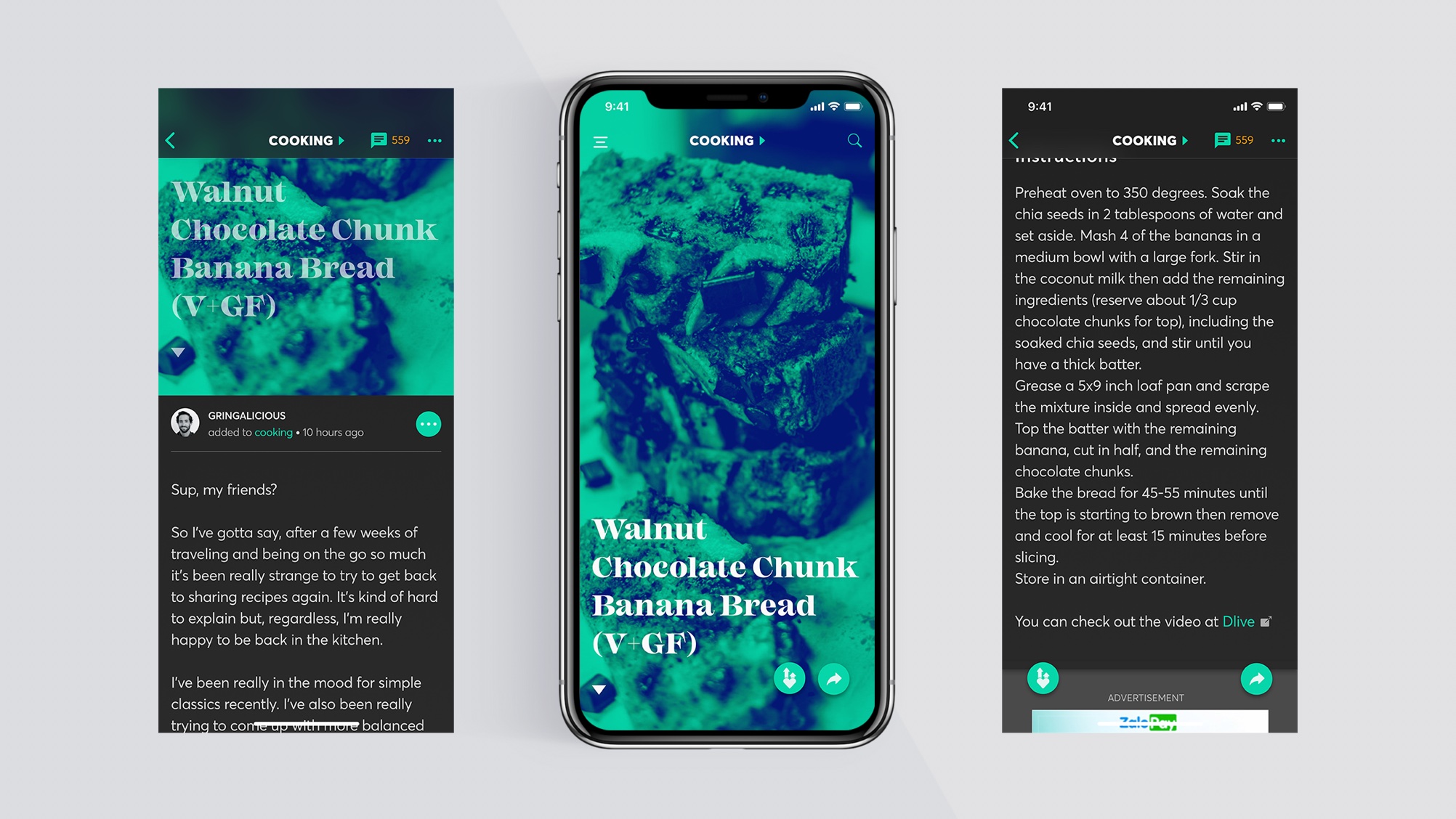
Landing on the post screen—the user will be presented with a duotone image with bold title, and on the right side of the screen two "call to action". one "call to action" will allow them to share the post and the other will allow bookmarking of the post. On the left section of the screen I've included a scroll indicator to help those that need a little hint (the arrow has an up/down effect with opacity and bounce) on which direction to scroll to view the rest of the post. Also at the top of the screen there's a text indicator that lets the user know what topic category they are currently in, this also doubles as a navigational element. If tapped the user will be taken to the related topics feed screen.
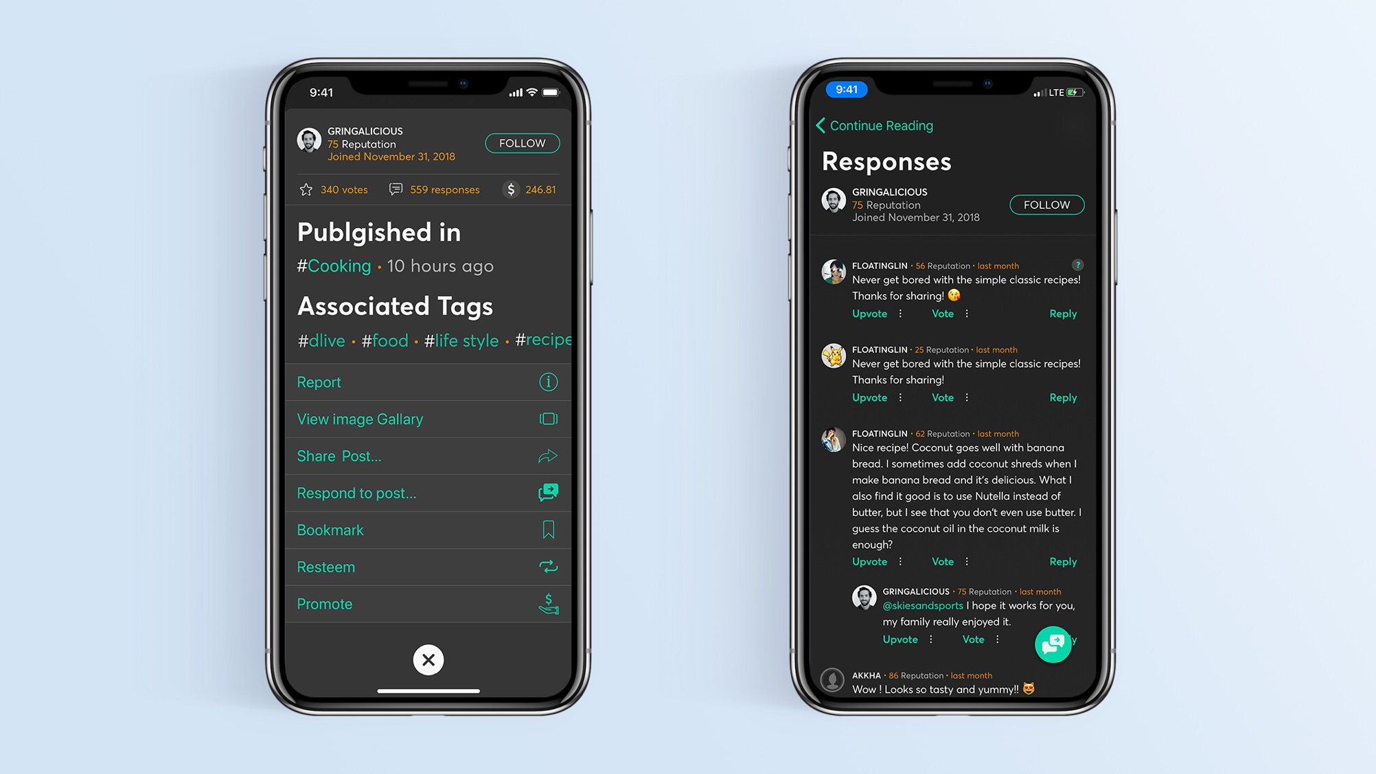
Action sheets can be a useful way to present the user with more options without having them transition away to another screen. Here we can see I've used an action sheet to provide the user with secondary action options, as-well-as displaying additional information about the user and the post. To facilitate easy exiting form the action sheet—I've positioned the close button in a very accessible area of the screen. No crazy thumb stretching going on here. 😉

Stay tuned there's still much more I need to do until this project is wrapped up, but I think I'm headed in the right direction. I'm sure that there will be some changes before I get to the final ui design. After that it's on to programming phase—so thanks for popping by and feel free to come-round again to see what's new.